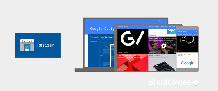
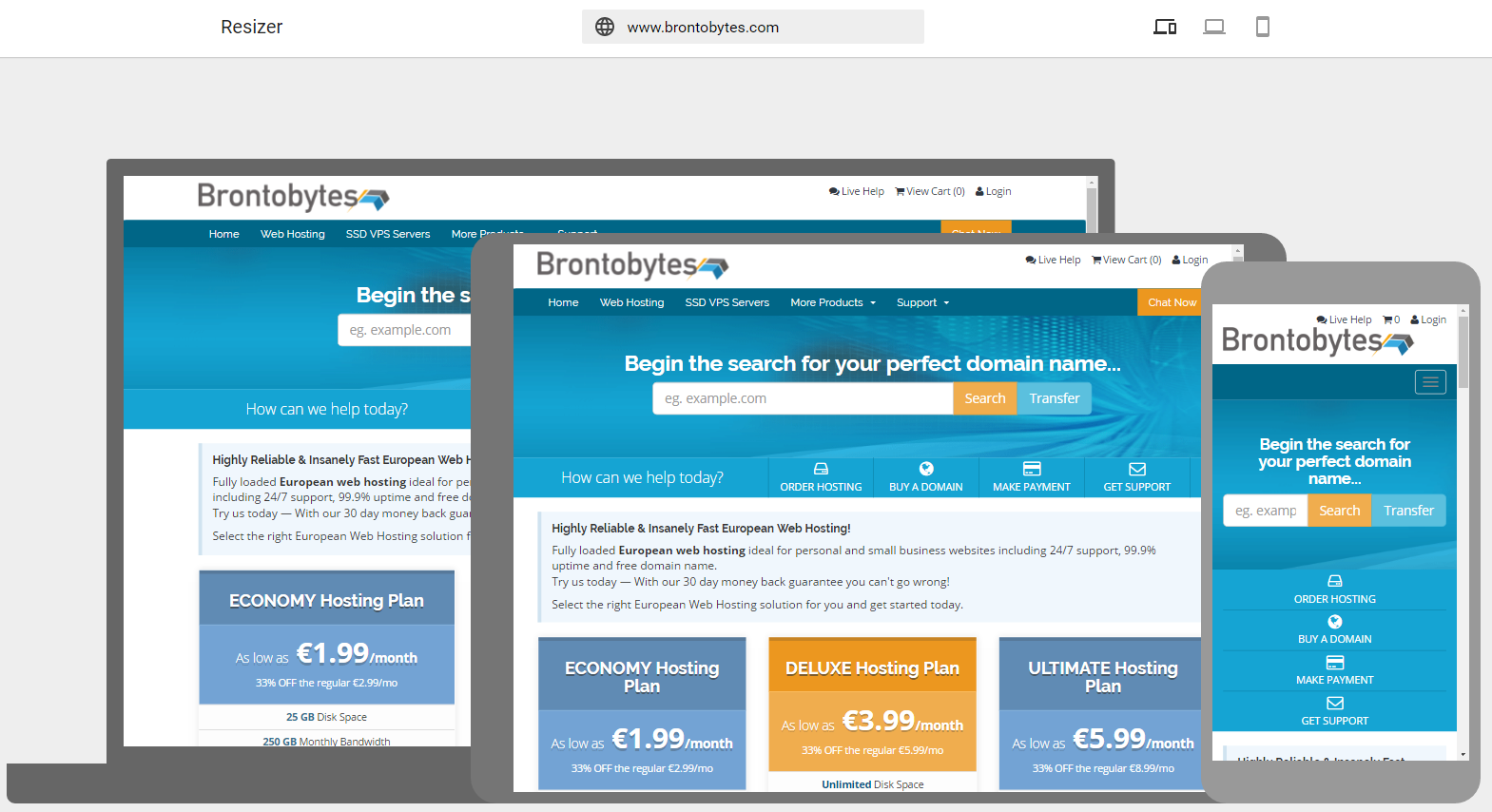
Google’s Resizer is a very useful and user-friendly tool for testing any website for responsive design. It permits you as a web developer to determine the right design to provide by letting you test materials design across various devices including Desktop, Tablet and Mobile.
There, a toolbar shows the three different setups, so you can interactively scroll and click in each one of them and view with landscape or portrait orientation on mobile.

Leave a Comment